Here, exclusivity is the true currency, where each experience is crafted for those who truly know how to play.
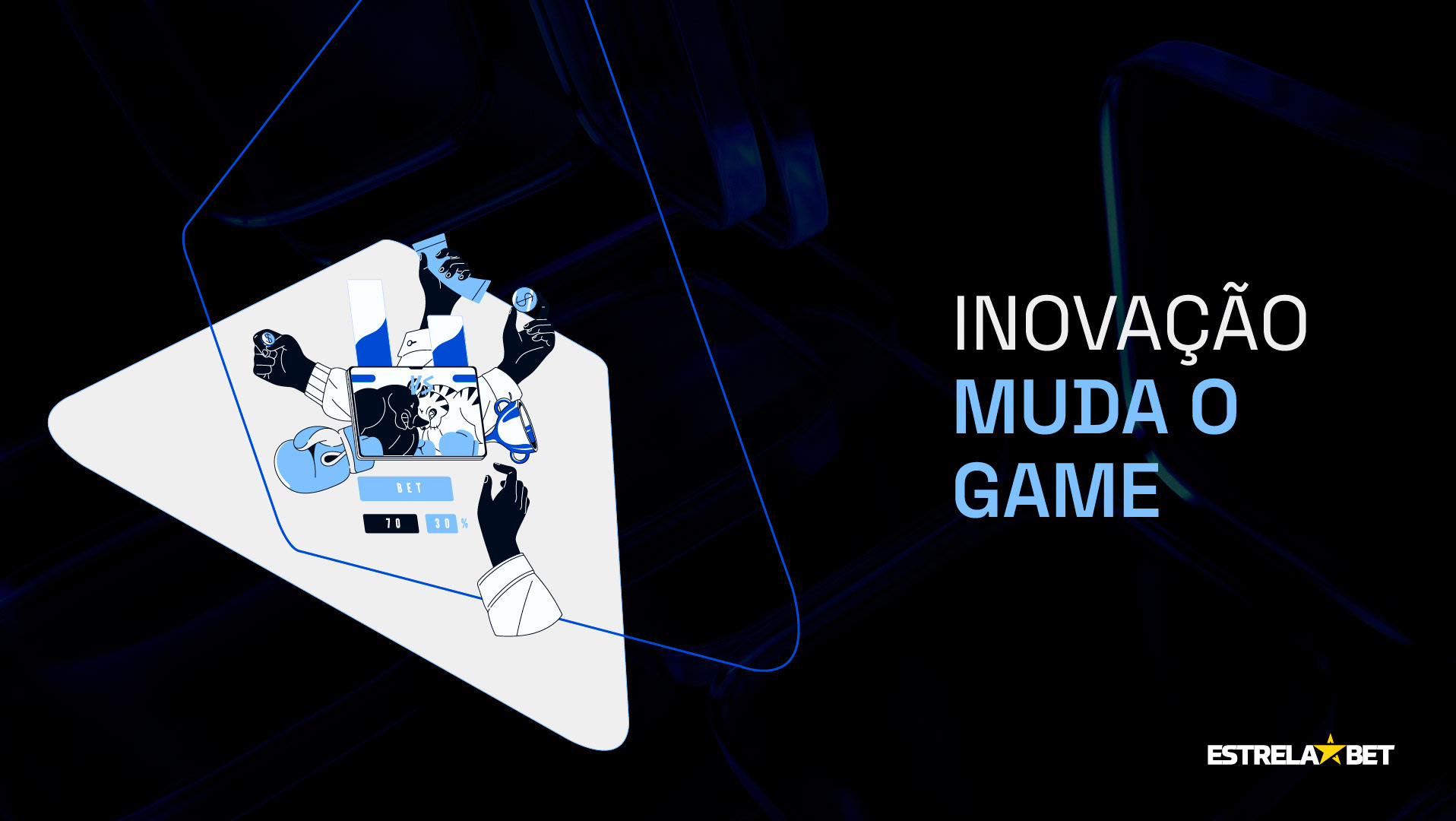
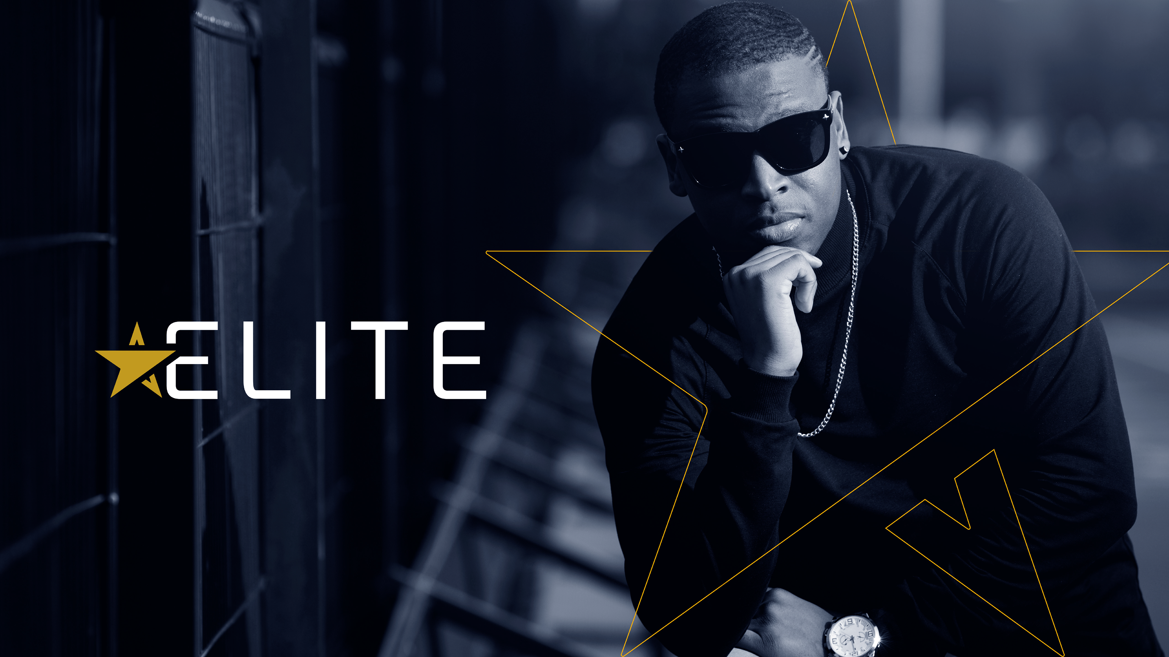
Meet ELITE, an innovative project by EstrelaBet that takes the VIP concept to a whole new level, with a brand that perfectly embodies what it means to be exclusive.
Meet ELITE, an innovative project by EstrelaBet that takes the VIP concept to a whole new level, with a brand that perfectly embodies what it means to be exclusive.
ELITE is a powerful symbol of recognition and a source of unforgettable experiences for those who master the art of playing.
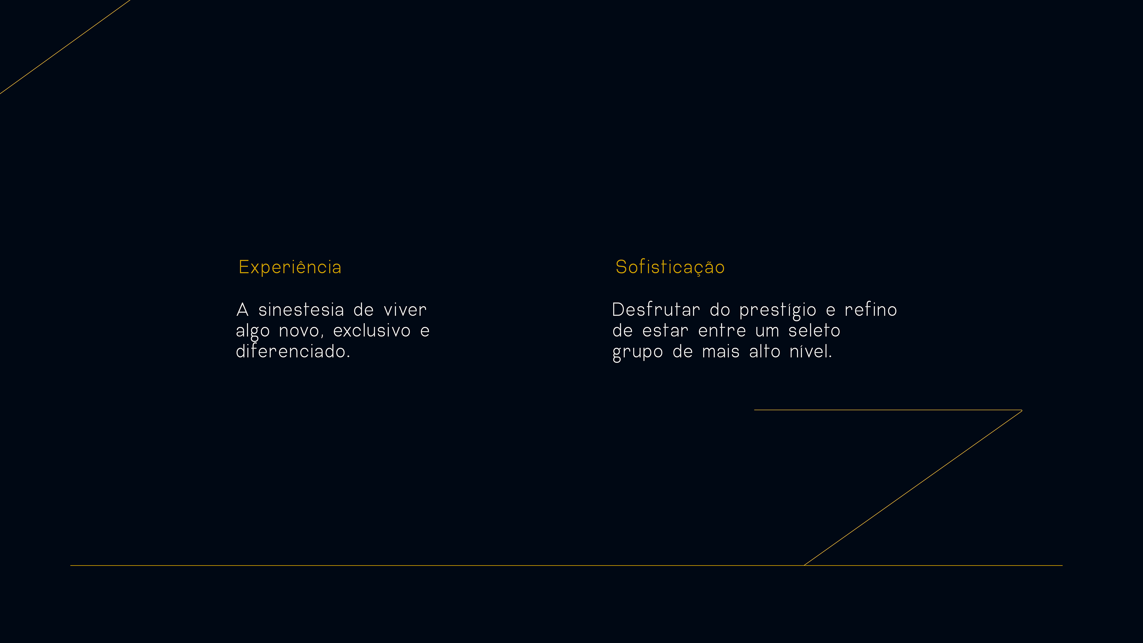
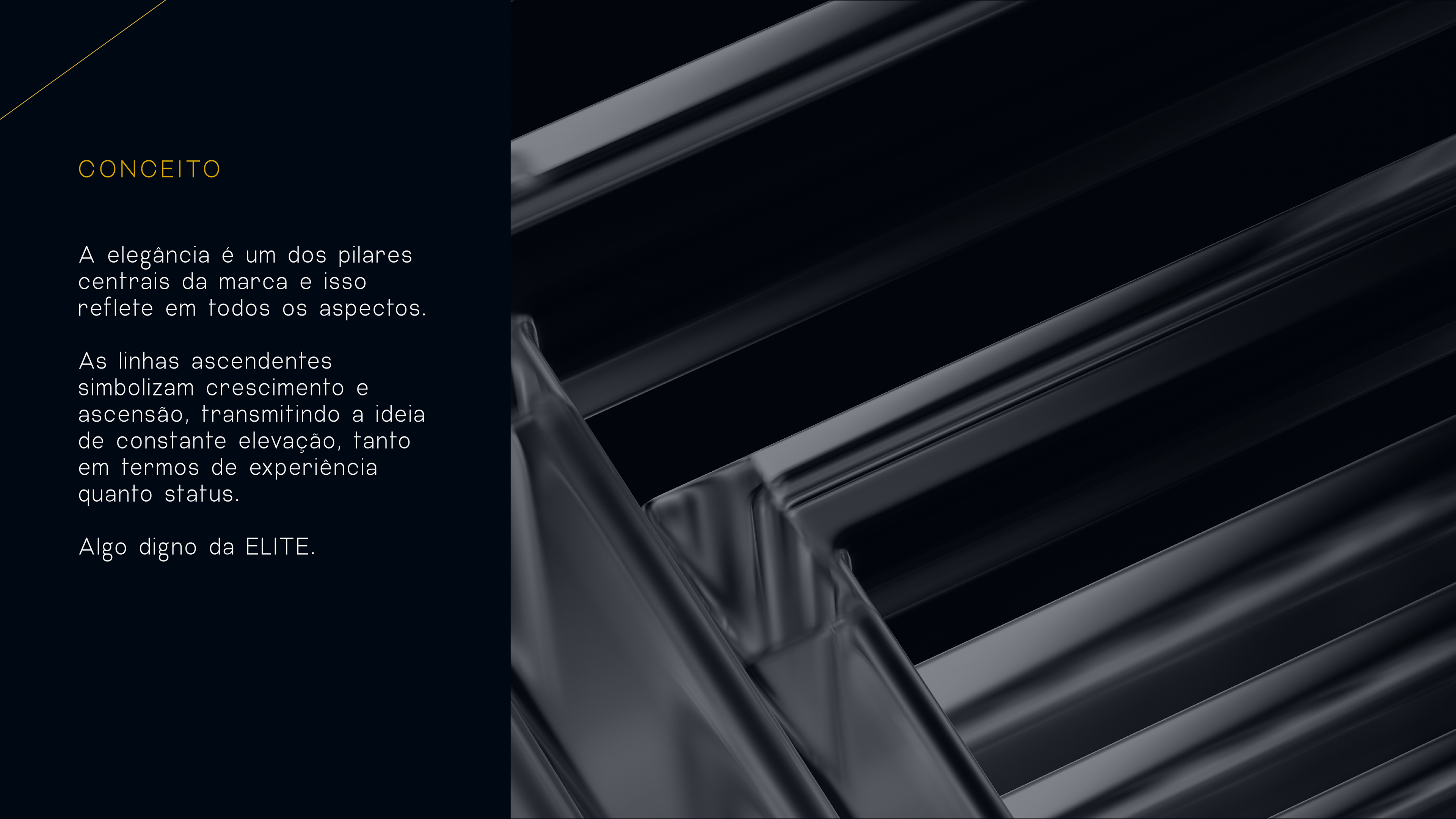
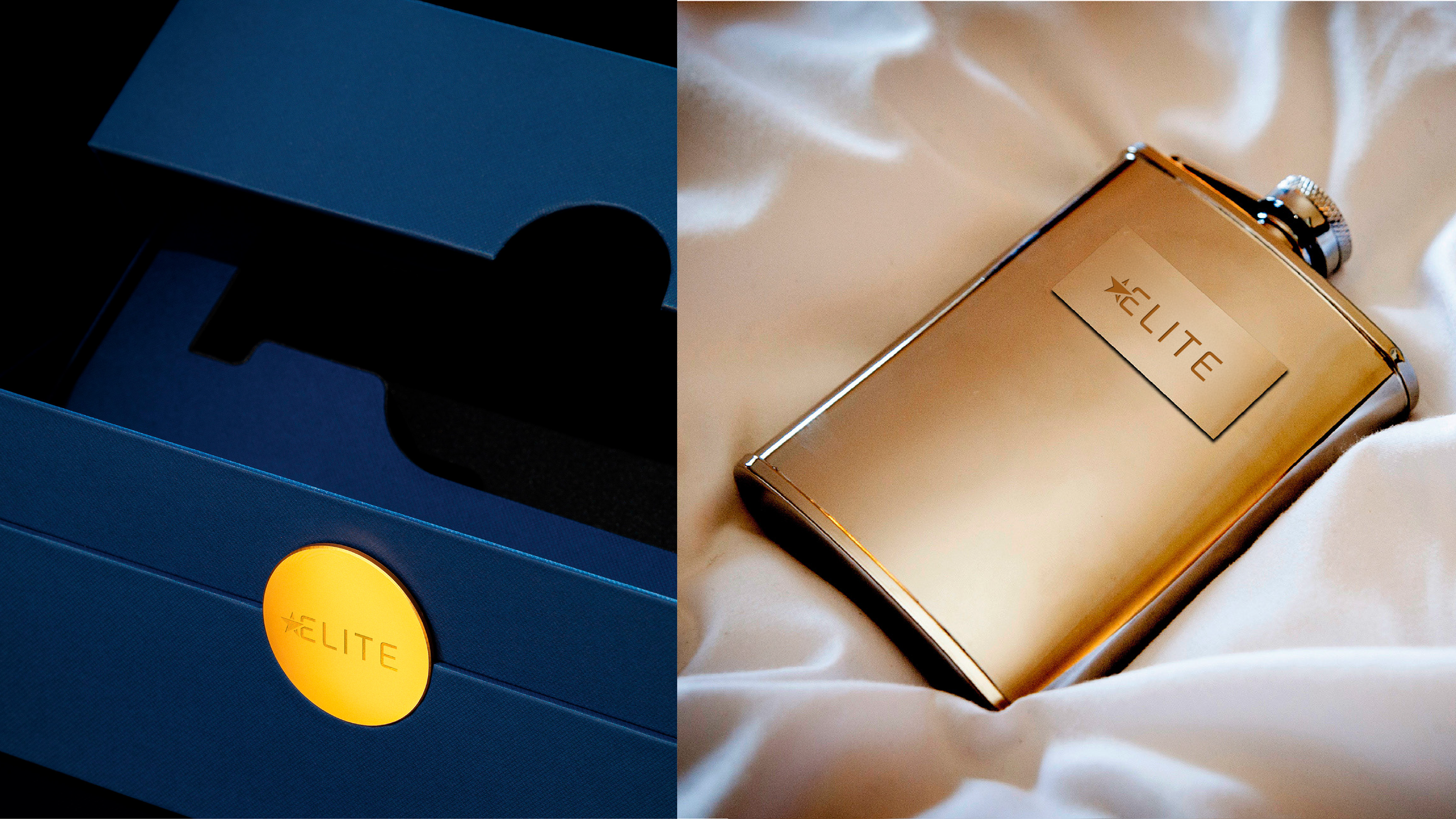
Elegance is one of the brand’s central pillars, and this is reflected in all aspects.
The ascending lines symbolize growth and elevation, conveying the idea of constant progress, both in terms of experience and status.
Something worthy of ELITE.
The ascending lines symbolize growth and elevation, conveying the idea of constant progress, both in terms of experience and status.
Something worthy of ELITE.
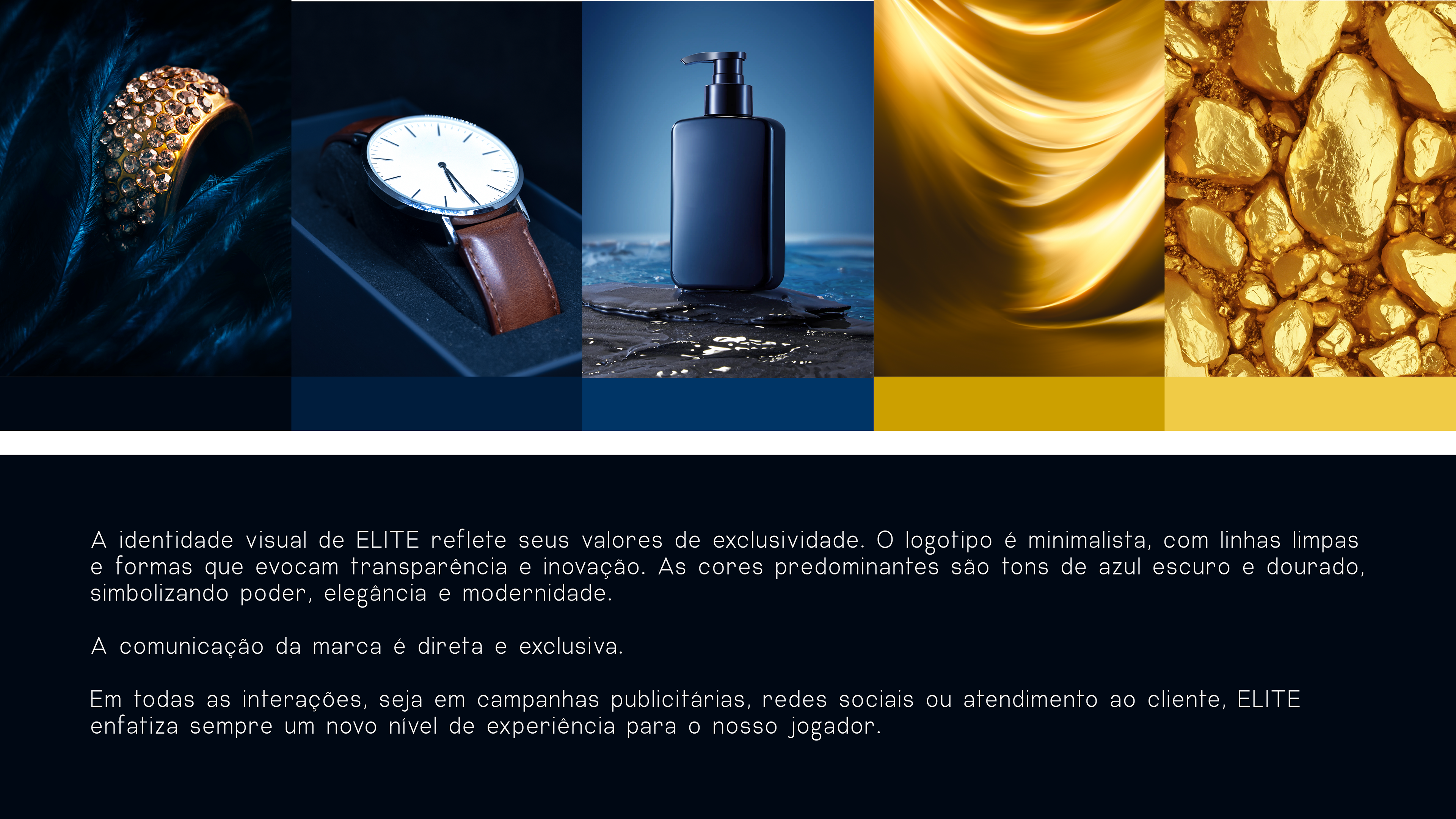
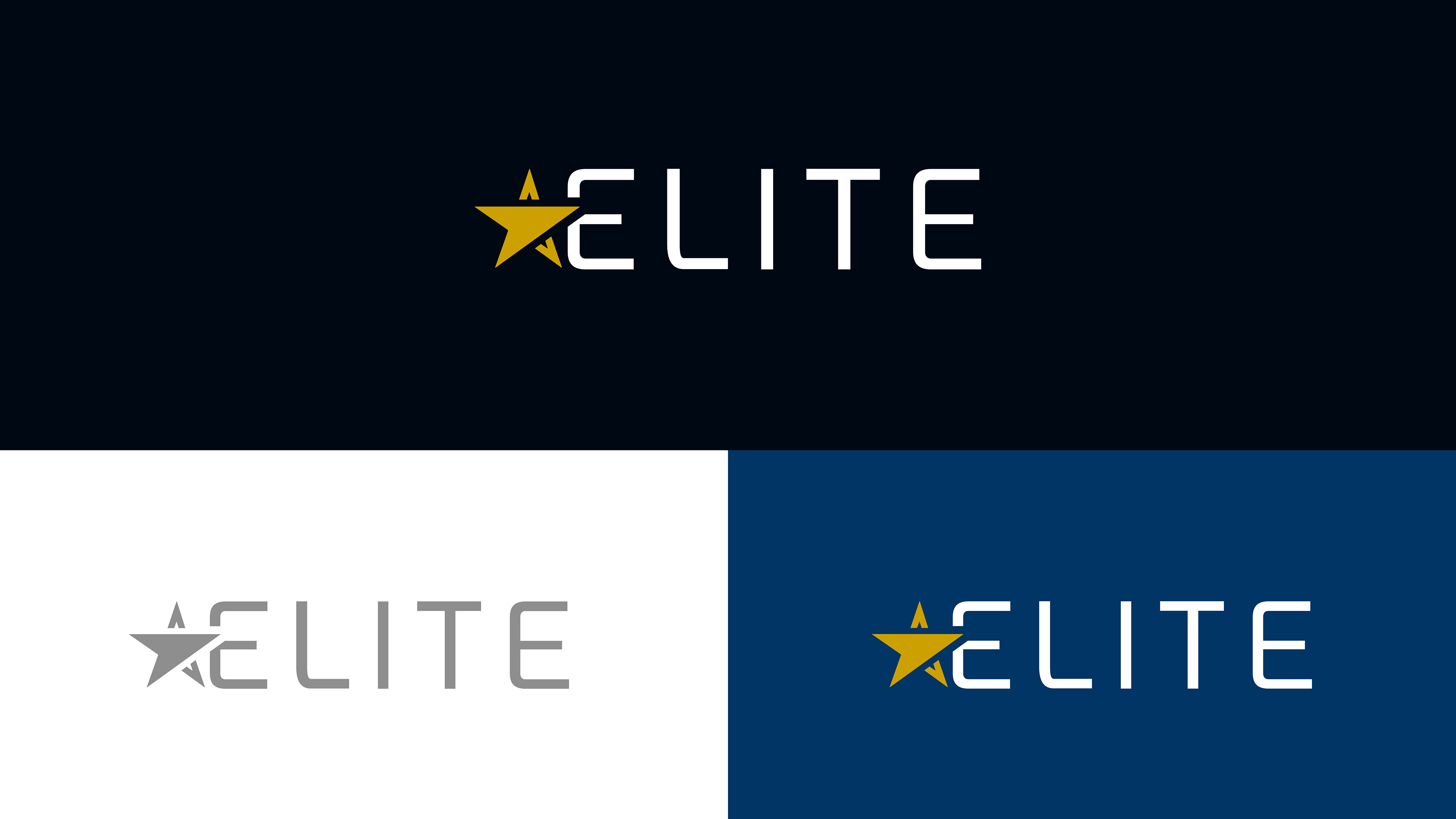
The visual identity of ELITE reflects its values of exclusivity. The logo is minimalist, with clean lines and shapes that evoke transparency and innovation. The dominant colors are shades of dark blue and gold, symbolizing power, elegance, and modernity.
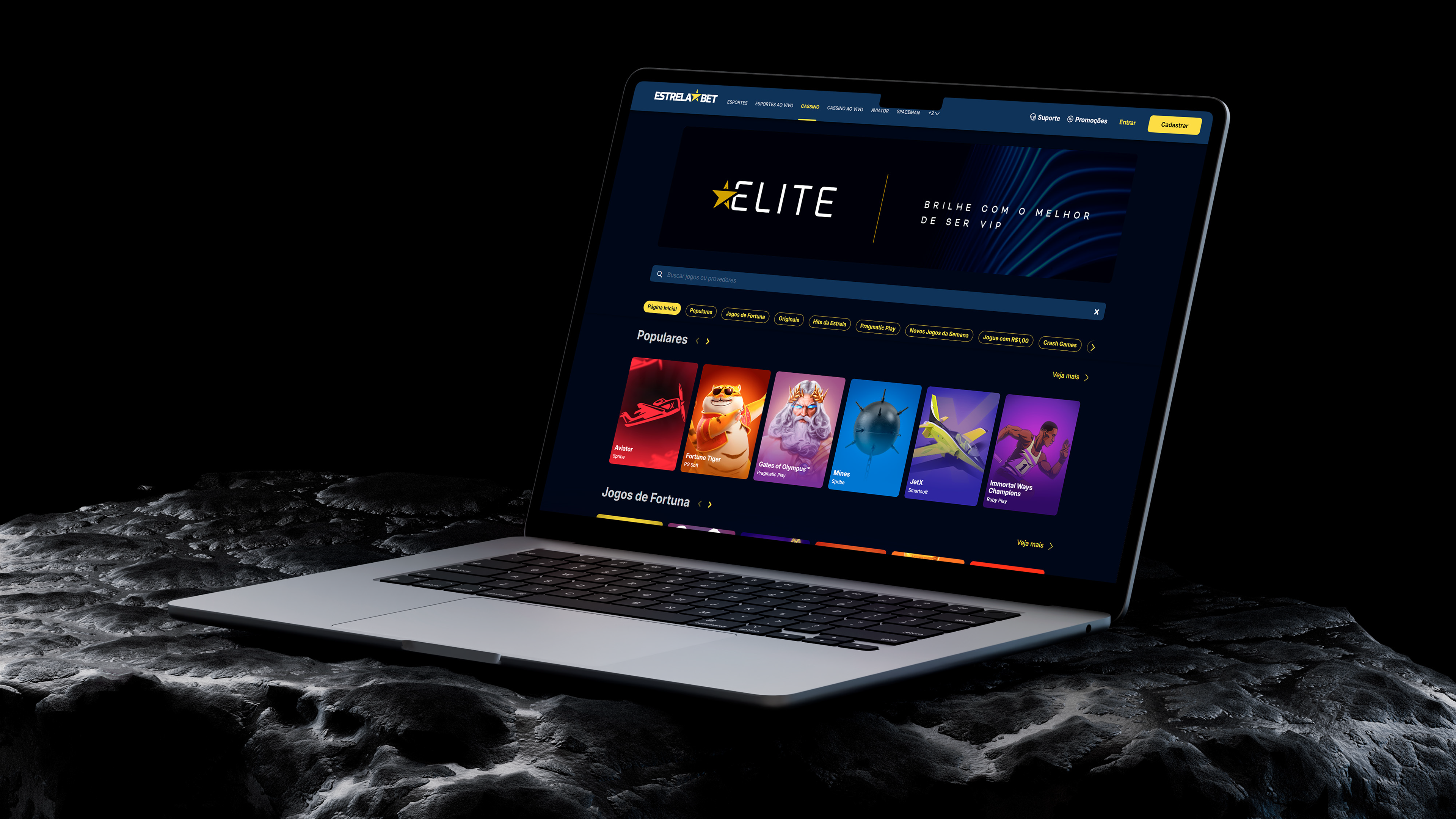
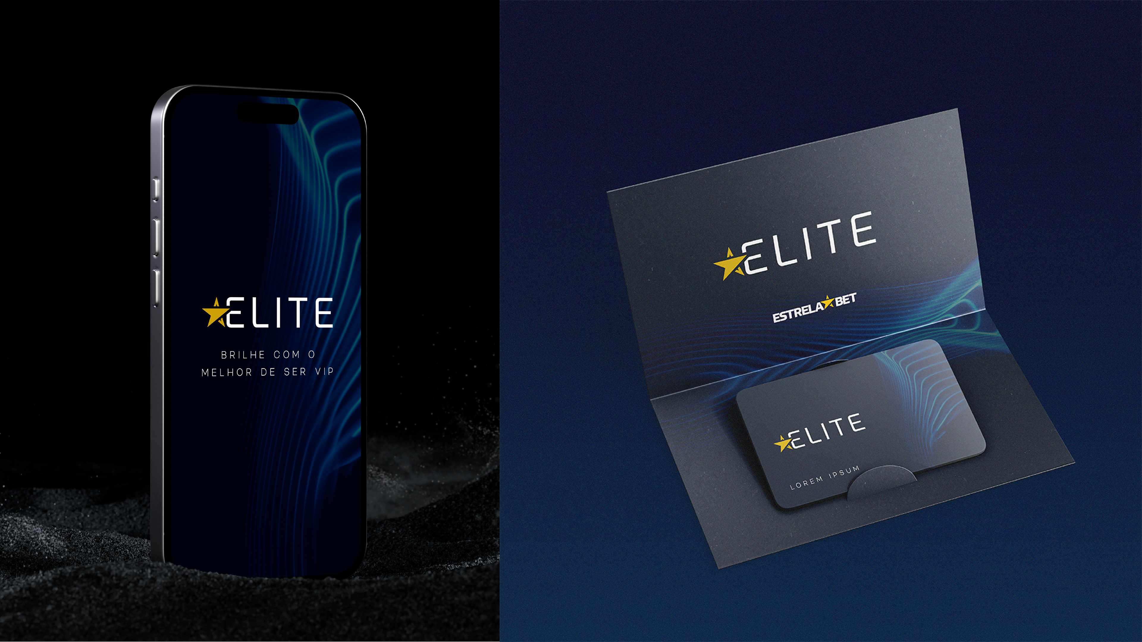
The brand communication is direct and exclusive.
In all interactions, whether in advertising campaigns, social media, or customer service, ELITE always emphasizes a new level of experience for our players.
The brand communication is direct and exclusive.
In all interactions, whether in advertising campaigns, social media, or customer service, ELITE always emphasizes a new level of experience for our players.
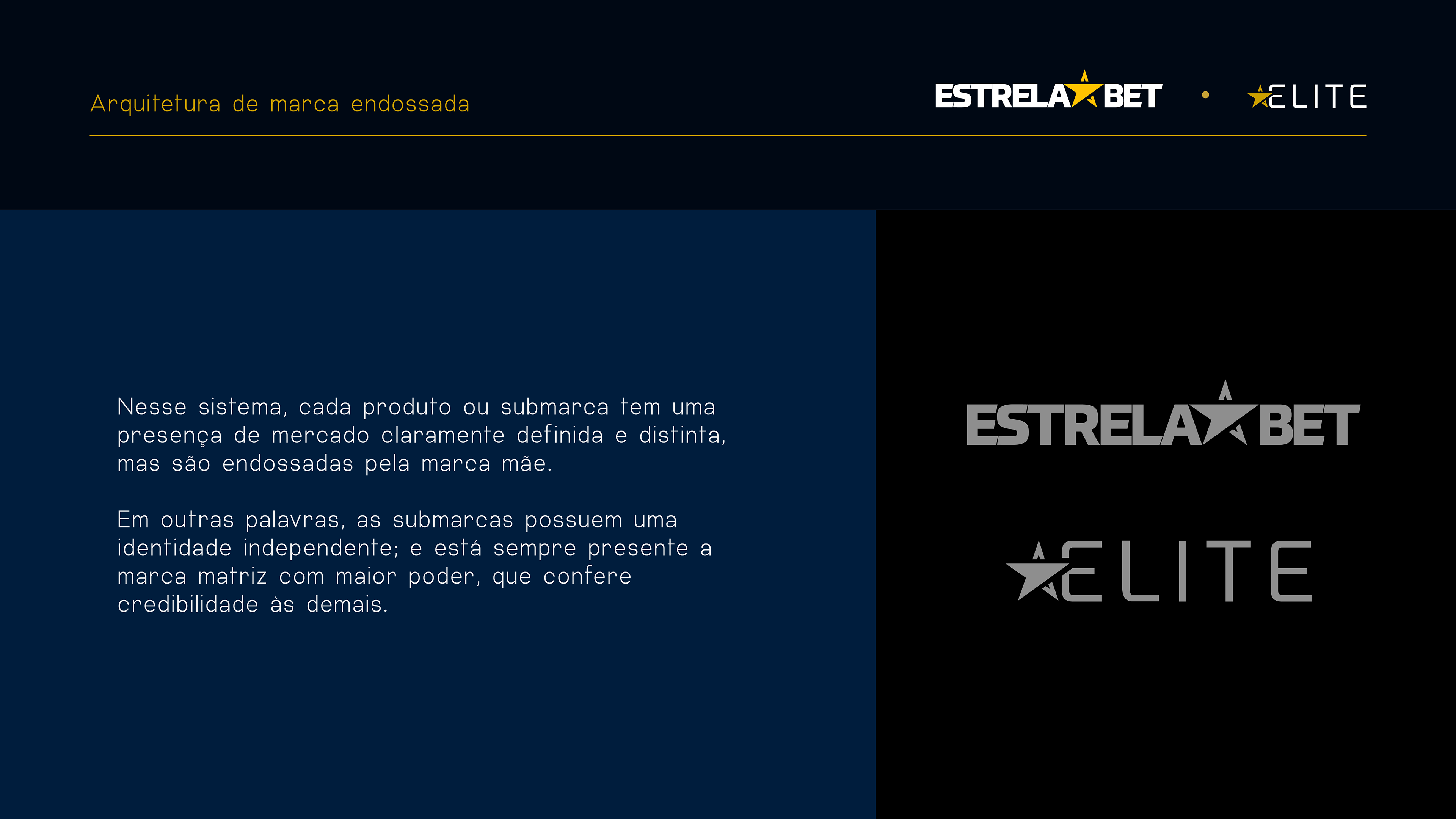
Endorsed Brand Architecture
In this system, each product or sub-brand has a clearly defined and distinct market presence, but they are endorsed by the parent brand.
In other words, sub-brands have an independent identity; yet, the parent brand with greater power is always present, lending credibility to the others.
In other words, sub-brands have an independent identity; yet, the parent brand with greater power is always present, lending credibility to the others.
"ELITE, EstrelaBet VIP Project"
Creative Art Directors: Lucas Miguel Mateos & Luiz Teixeira
Creative Copywriters: Rafael Costa Soares & Letícia Borges
Creative Coordinator: Thais Brazil
Creative Manager: Tamara Ribeiro
Creative Art Directors: Lucas Miguel Mateos & Luiz Teixeira
Creative Copywriters: Rafael Costa Soares & Letícia Borges
Creative Coordinator: Thais Brazil
Creative Manager: Tamara Ribeiro